BootStarp4自定义编译-栅格及响应式大小设置等备忘
bootstarp4是一个很好的前端框架,最近有一个前端项目 ,在制作的时候需要修改默认的xl、lg、md、sm等的默认大小。其实本来每个页面自己使用媒体查询去覆盖也是可以实现的,不过这样就肯定不方便了。在查看了官网的文档和一些第三方翻译的文档后,我发现国内的翻译文档基本都没怎么说清楚。都只是提到了Sass mixins可以自己创建什么的,然后给出了一些变量什么的,看的一脸懵逼。(当然我也是个前端菜鸡)。在琢磨了老半天后,在官网也看了老半天文档,找到了一个定制地址https://getbootstrap.com/docs/3.4/customize/,这个确实也很方便,就是可以自己输入一些我们的默认配置,然后系统就会根据我们的设置帮我们打包生成。我擦这不就是我想要的吗?页面配置样式很多,大概如下。
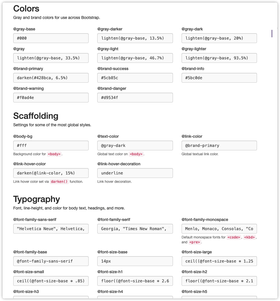
但是实际下载下来发现这个版本是bootstarp3的,4的我也没找到在哪里,然后就又各种翻资料。最终找到了解决方法。
需要用到的工具
Node.js编译工具Bootstarp4源码下载,直接官网下载源码即可
修改配置(需要先下载源码)
下载源码后,在scss目录下的_variables.scss里面就可以找到配置项目了。
在仔细一看,这不就是和上面那个页面一样的吗 里面分了
// Color system 颜色设置
// Spacing 间距
// Body “<body>”元素的设置。
// Links 链接相关样式设置
// Grid breakpoints 栅格断点相关(这不就是我要找的吗)
....
关于栅格相关设置
这里面的配置其实还挺多的,不过主要就是这3个Grid breakpoints 栅格断点、Grid containers 栅格容器、Grid columns 栅格列。
// Grid breakpoints
//
// Define the minimum dimensions at which your layout will change,
// adapting to different screen sizes, for use in media queries.

$grid-breakpoints: (
  xs: 0,
  sm: 576px,
  md: 768px,
  lg: 992px,
  xl: 1200px
) !default;

@include _assert-ascending($grid-breakpoints, "$grid-breakpoints");
@include _assert-starts-at-zero($grid-breakpoints, "$grid-breakpoints");


// Grid containers
//
// Define the maximum width of `.container` for different screen sizes.

$container-max-widths: (
  sm: 540px,
  md: 720px,
  lg: 960px,
  xl: 1440px
) !default;

@include _assert-ascending($container-max-widths, "$container-max-widths");


// Grid columns
//
// Set the number of columns and specify the width of the gutters.

$grid-columns:                24 !default;
$grid-gutter-width:           30px !default;
$grid-row-columns:            6 !default;
这时只要根据上面的参数对应修改就好了,比如我就将xl改成了1440px。不过需要注意一下,breakpoints 和containers 都需要调整一下。
breakpoints 断点
- 定义布局更改的最小尺寸
- 适应不同的屏幕尺寸,用于媒体查询
containers 容器
- 为不同的屏幕大小定义容器的最大宽度
重新打包编译
先删除dist文件夹下的所有内容
1、先执行npm install
他会安装sass和一些他需要的模块,这里要耐心等待一下,或者使用cnpm也可以。
2、在执行npm run dist即可。
如果遇到各种报错的问题,请先更新node、npm到最新版本在进行尝试
附录说明
官方的github地址: https://github.com/twbs/bootstrap
关于操作步骤的说明 Running documentation locally Run npm install to install the Node.js dependencies, including Hugo (the site builder). Run npm run test (or a specific npm script) to rebuild distributed CSS and JavaScript files, as well as our docs assets. From the root /bootstrap directory, run npm run docs-serve in the command line. Open http://localhost:9001/ in your browser, and voilà.